

Luminary Books
This branding project was a created around the idea of utilizing an animal within a brand. I chose a moth to represent enlightenment, which led to branding attributes such as community, belonging, and ingenuity. Through the phases of this project I was able to explore in the sketching and iteration stages, and come away with a complete set of brand guidlines.
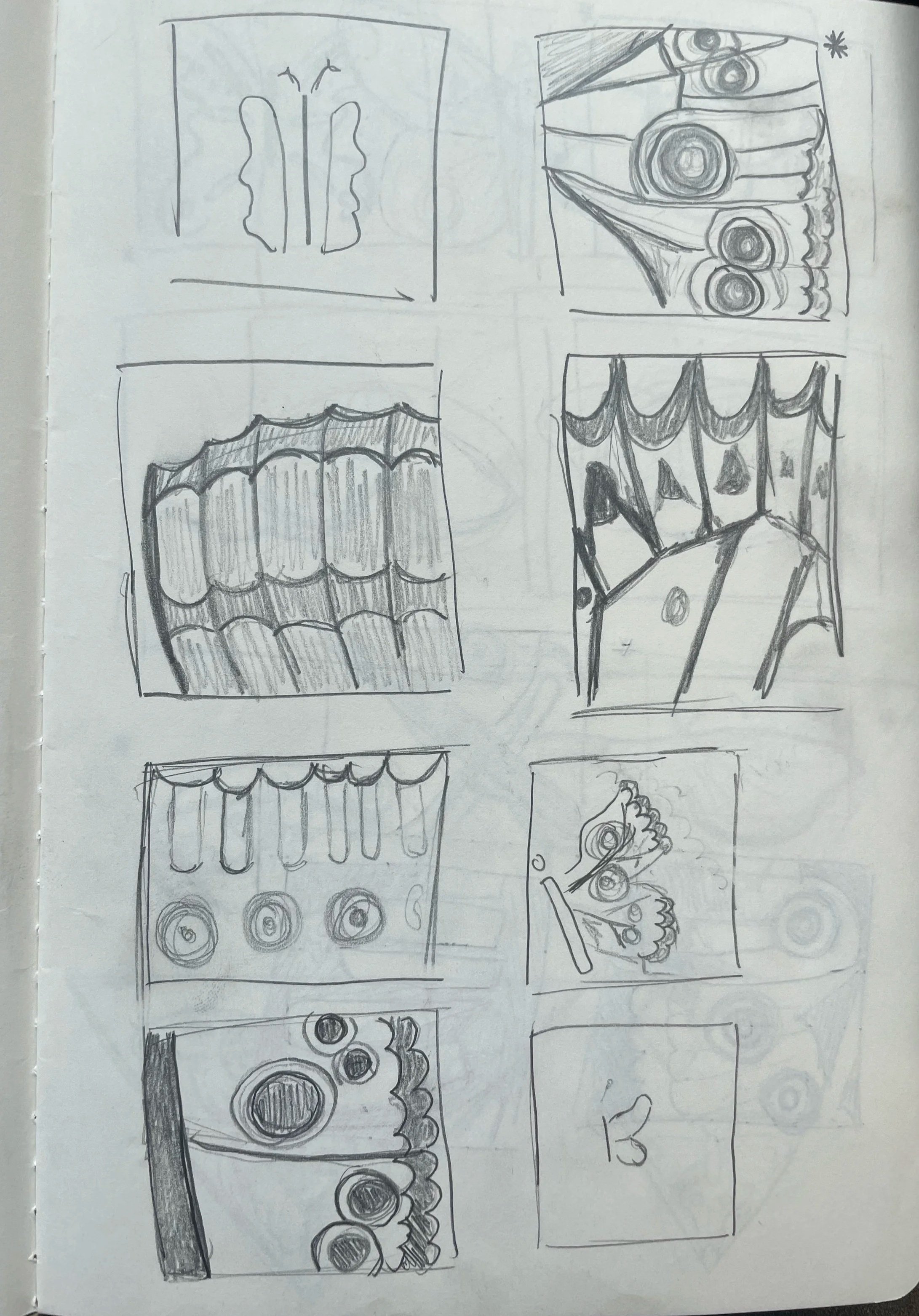
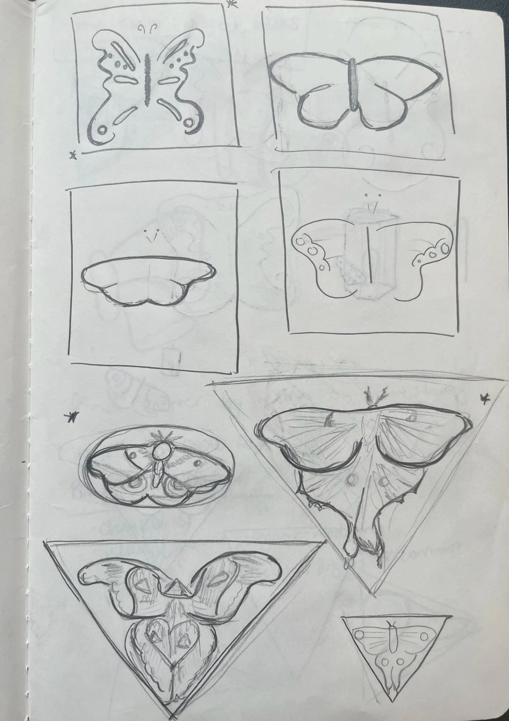

Sketching.
Beginning with a moth, I spent time sketching, exploring the form, texture, and movement, of the animal. I was able to gain a deeper understanding of shapes and patterning that I would be working with throughout the project.

Iteration.
After the initial sketches I moved into digital iterations with procreate and Illustrator. I played with how the moth could be grounded rather than floating in space. The lightbulb emphasized the idea of illumination of the mind, fitting for the concept of the bookstore. This exploration led me to the idea of subtle illumination and how I could incorporate it in a minimal way.





Final Logos.
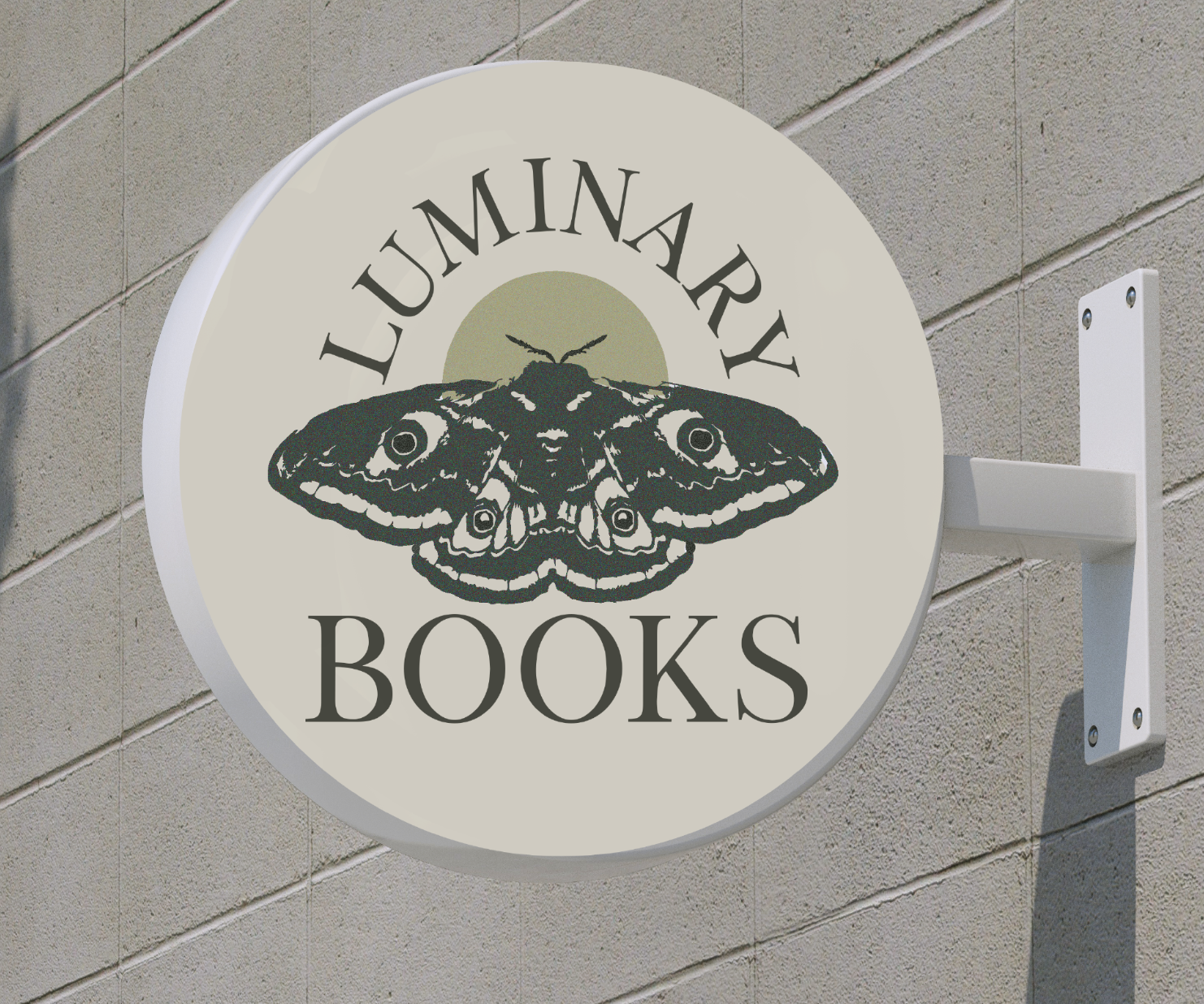
The final version of this logo came together in an unexpected way for me. I found that I was draw to the texture in the moth’s wings, leading me away from the originally illustrative design. It tied together the idea of a natural and collective community that the bookstore was build around. I also moved to a simplistic light source, using that simplicity to elevate the detail in the wings.
Deliverables.
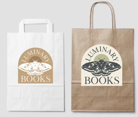
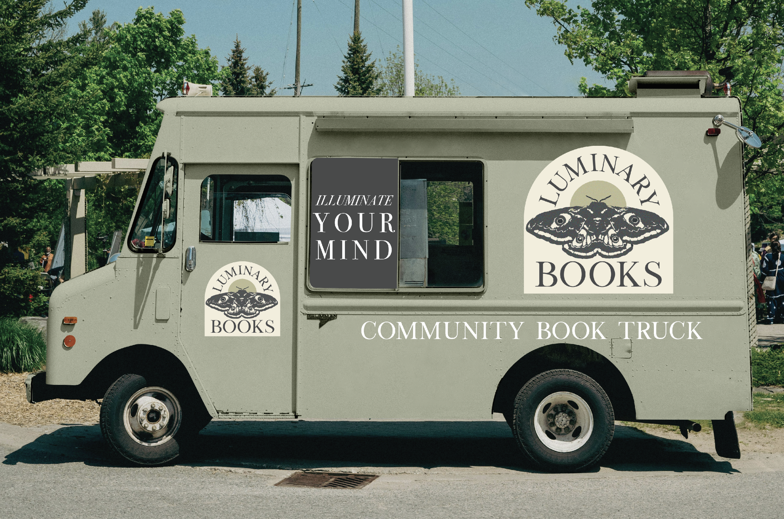
As part of the Luminary Books identity, I designed a suite of branded applications that bring the system into everyday use. This includes exterior graphics for the book truck, a set of branded shopping bags, a custom notebook and journal series, and the primary storefront sign. Each piece extends the core visual language of the brand, translating its warmth and creative energy into functional, tactile experiences.

Brand
Standards.
This brand standards guide lays the foundation for how Luminary Books shows up in the world. I translated its mission as a third-space built on community, creativity, and expression into a visual and verbal system that feels consistent, welcoming, and purposeful. The guide defines the core elements of the brand including typography, color, logo usage, layout principles, and tone so every touchpoint feels aligned. It brings clarity to each design decision and ensures the identity stays cohesive as it grows and more people work with it.
