Flourish Therapy
For this project, we were given a location and a business name and were asked to imagine what the brand could become. With “Flourish” set in Woodstock, New York, I developed it into a therapy practice centered on growth, grounding, and accessible care.
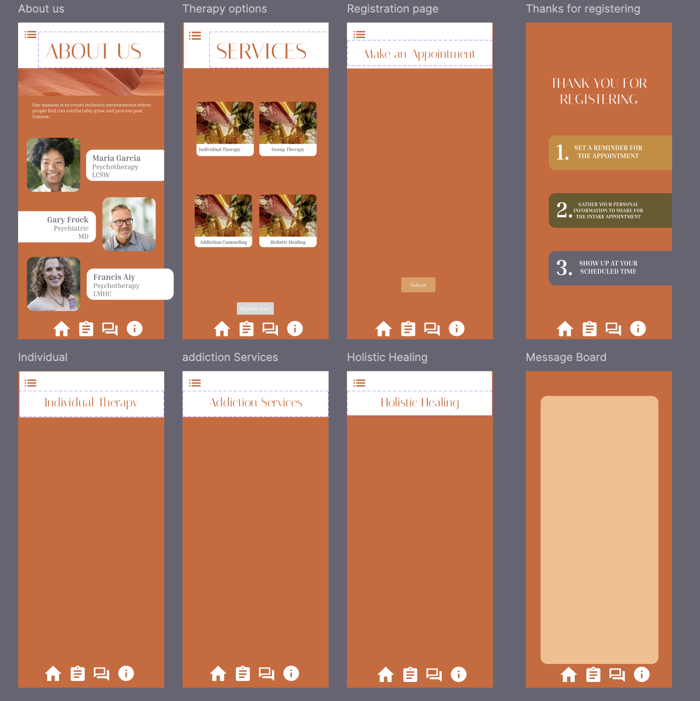
Using Figma, I created a full mobile prototype that includes session scheduling, therapist profiles, wellness tools, and reflective prompts. The interface is structured around gentle visual hierarchy, soft rhythm, and intuitive navigation to make the experience feel calm and supportive for users seeking mental health resources.
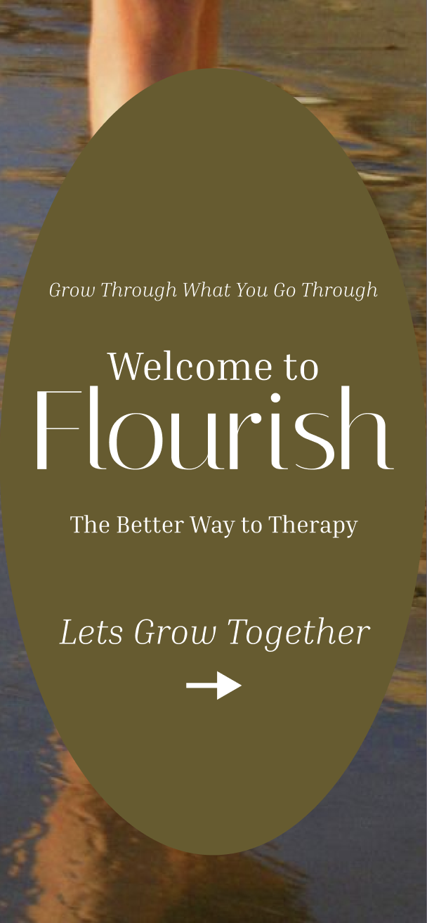
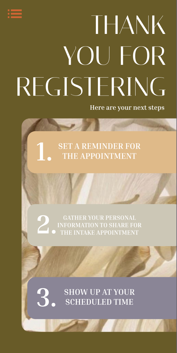
The final design shows how the brand functions within a mobile environment, from onboarding to core service pages. My focus was on creating an experience that feels warm, approachable, and clear, while maintaining a cohesive visual system that reflects the ethos of both the name and the location. This project strengthened my skills in mobile UI, interaction flow, and building a brand-led digital product from the ground up..
Audience.
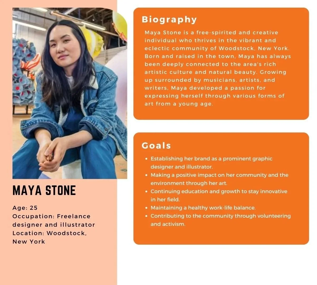
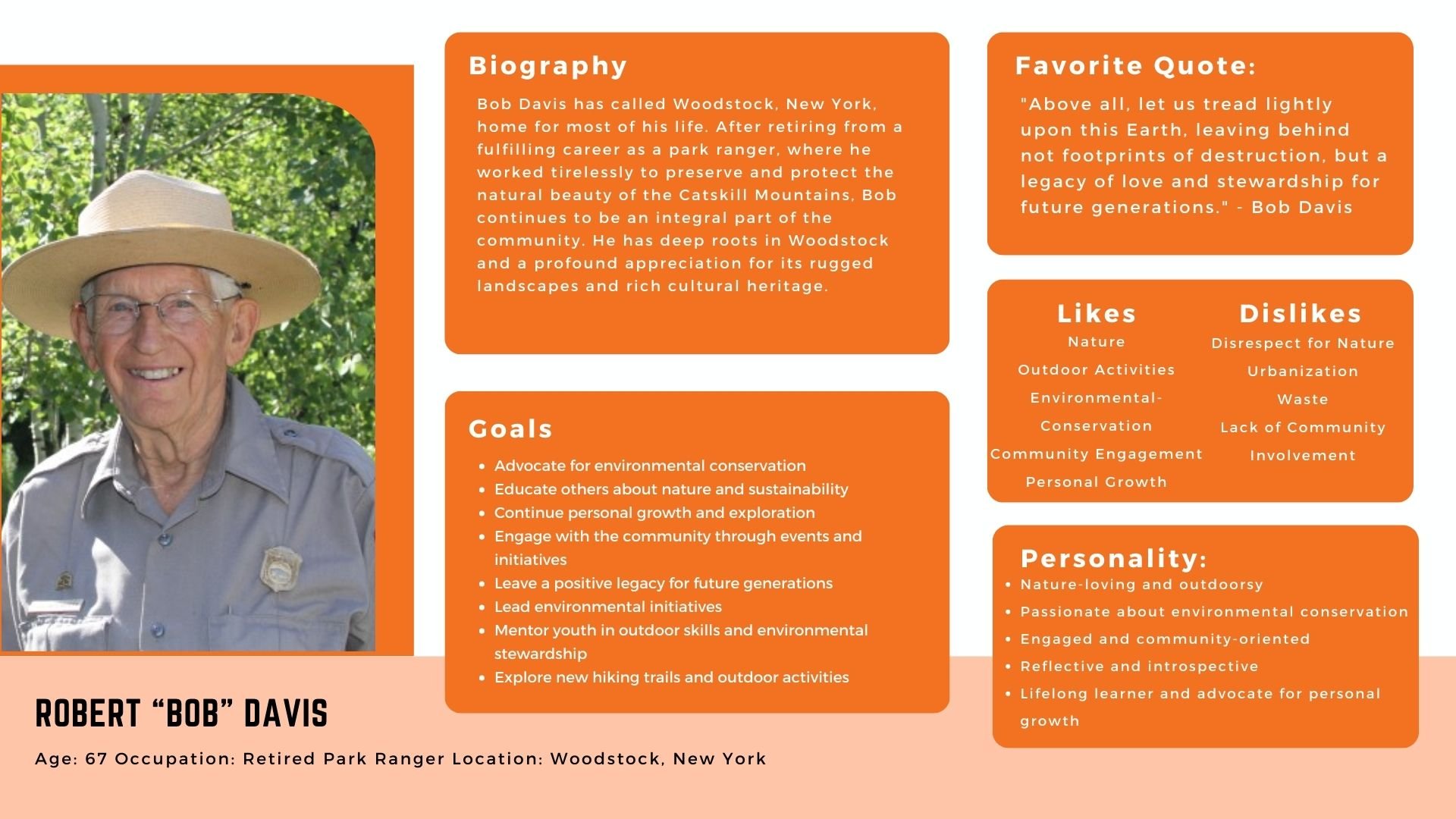
To better understand the needs of potential users, I created two personas that represent the core audiences for Flourish Therapy. Each persona outlines the user’s background, personality, goals, likes and dislikes. These profiles helped guide decisions around tone, navigation, and feature priority, ensuring the final app feels approachable, supportive, and genuinely useful for the people it aims to serve.
Direction.
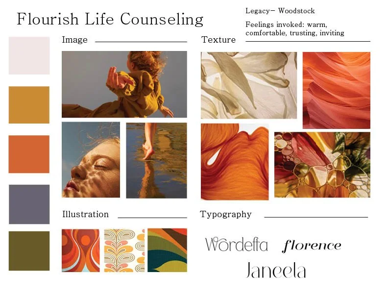
I built this moodboard to establish a visual tone that feels warm, grounded, and inviting. The imagery and textures focus on natural light and organic movement, creating a sense of calm and trust. The earthy palette and retro-inspired illustrations nod to Woodstock’s creative energy, and the type choices keep everything feeling soft but intentional. Together, these elements shaped the foundation for the brand’s overall look and feel.

Building.
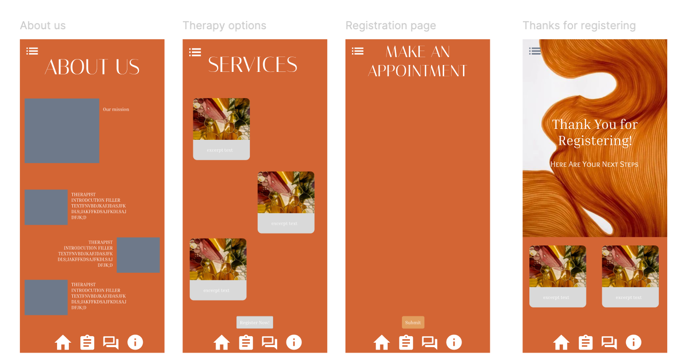
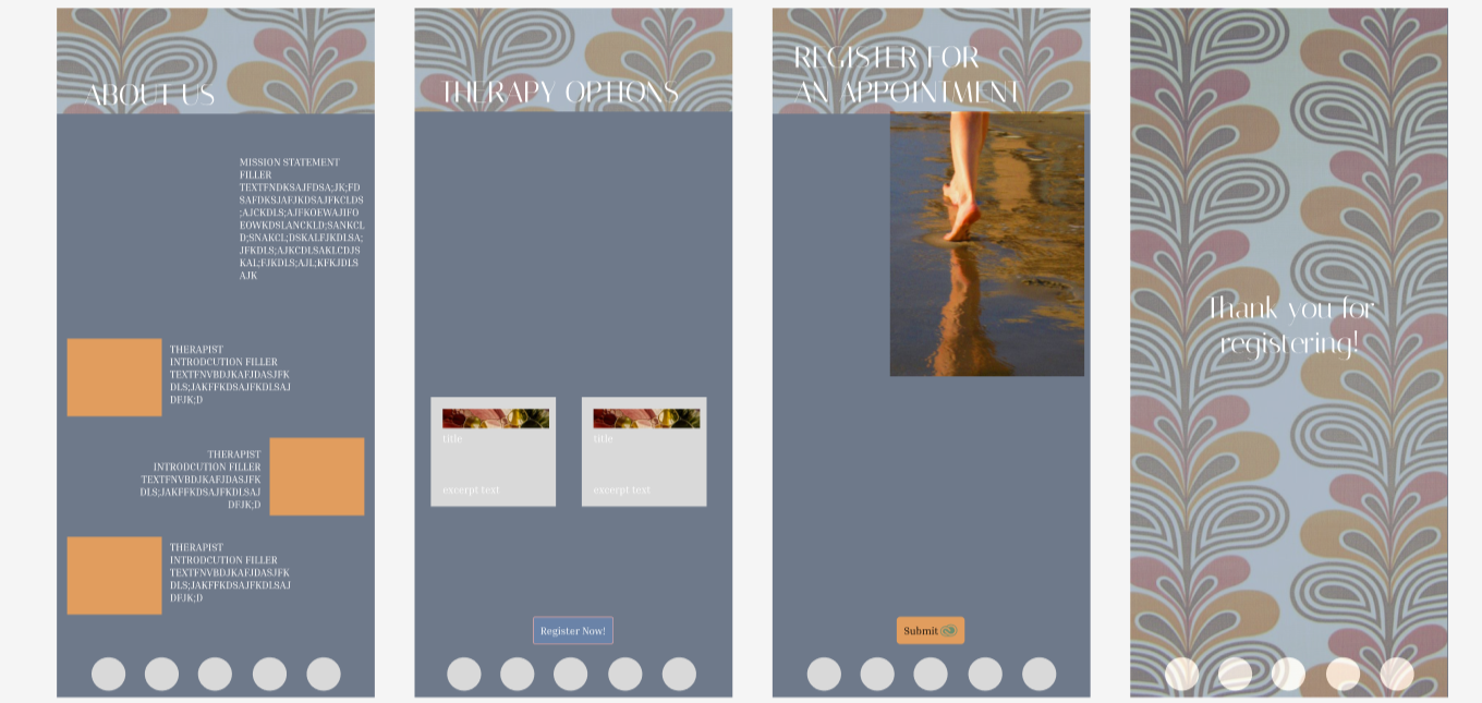
This was my first time working in Figma, so the project became equal parts designing the app and learning the tool itself. I learned how to build interactive flows, organize components, and turn static screens into a functioning prototype. Working through the mechanics of transitions, pacing, and usability helped me understand how visual decisions translate into real user experience, and gave me a stronger foundation in mobile UI overall.
Product.
The final app brings the visual direction and user research together in a calm, intuitive mobile experience. Each screen is designed to feel clear, supportive, and easy to navigate, with a visual system that reflects the grounding energy of Woodstock. The prototype shows how the brand functions as a real product, from onboarding to scheduling to wellness tools. It demonstrates a cohesive, thoughtful interface built to make mental-health support feel approachable and accessible.
