
Sustainably Savvy
Sustainably Savvy is a de-influencing campaign that challenges the way we think about overconsumption in the fashion industry. I wanted to create something bold, direct, and a little disruptive—something that makes people pause and question their everyday purchasing habits.
The campaign uses layered textures, striking typography, and collage-style imagery to communicate urgency while pushing for more mindful, sustainable choices. As part of the project, I designed a series of posters and a zine that bring these ideas to life in a tangible, visual way.
Research.
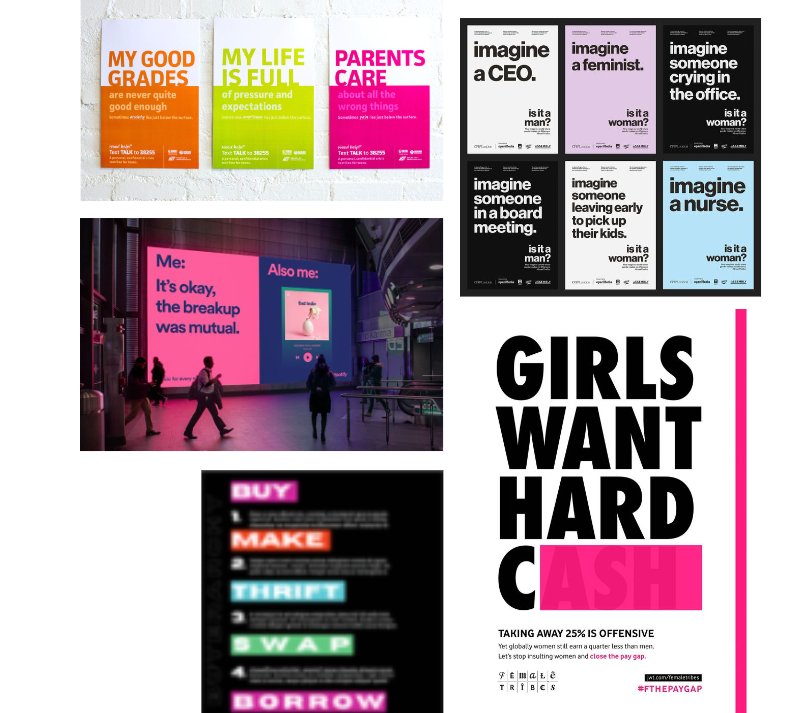
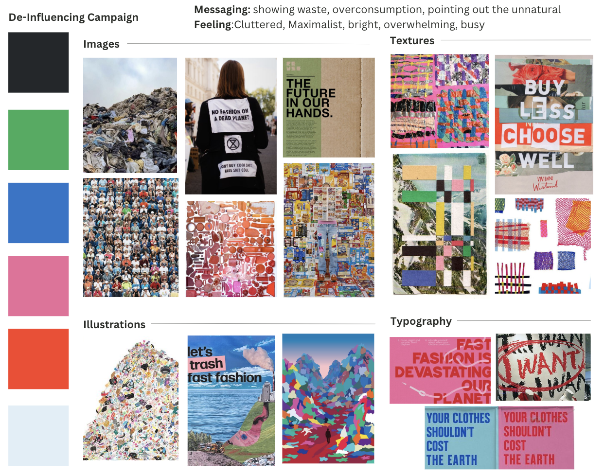
In the research phase, I explored a range of bold visual styles, protest-inspired graphics, and maximalist textures to understand how urgency and impact are communicated. Because this was a self-directed project, I let myself step outside my usual design style and dive into references that felt loud, messy, and energetic.
Studying overconsumption messaging, fashion waste imagery, and de-influencing trends helped me shape a visual language that feels both confrontational and intentional.

Initial Concepts.
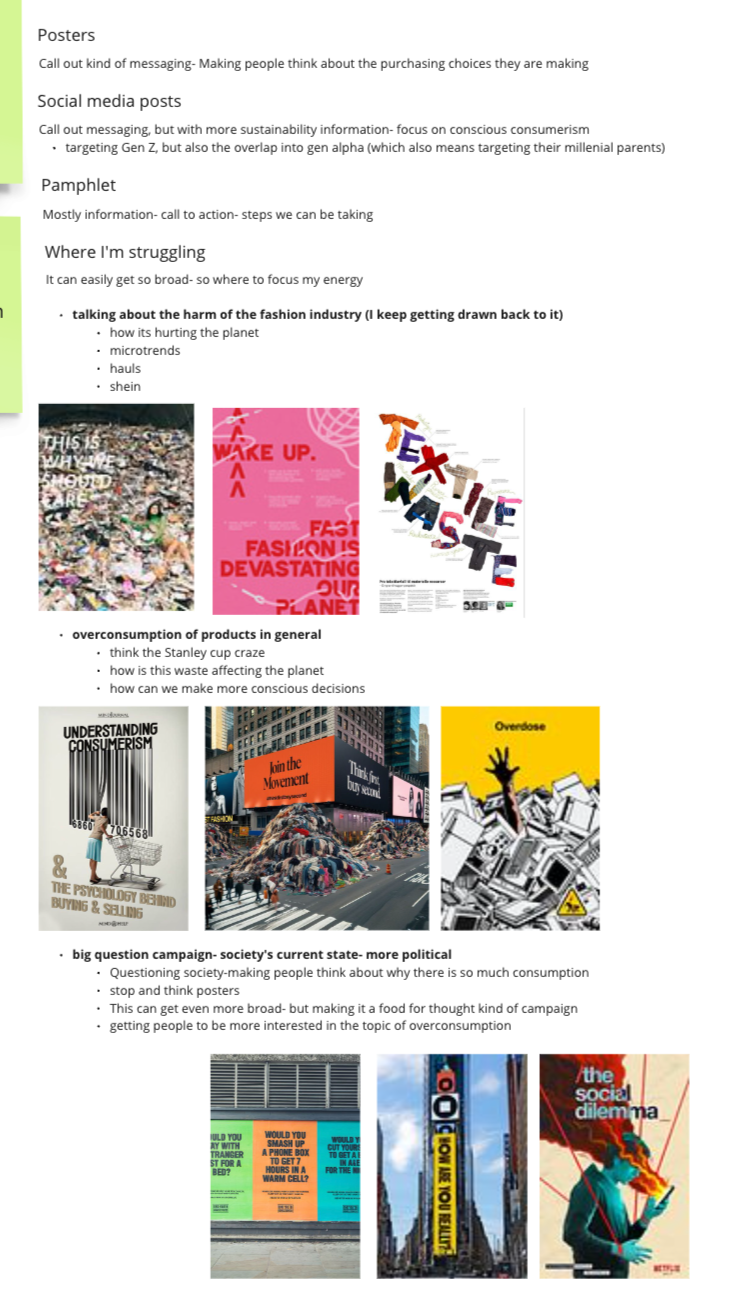
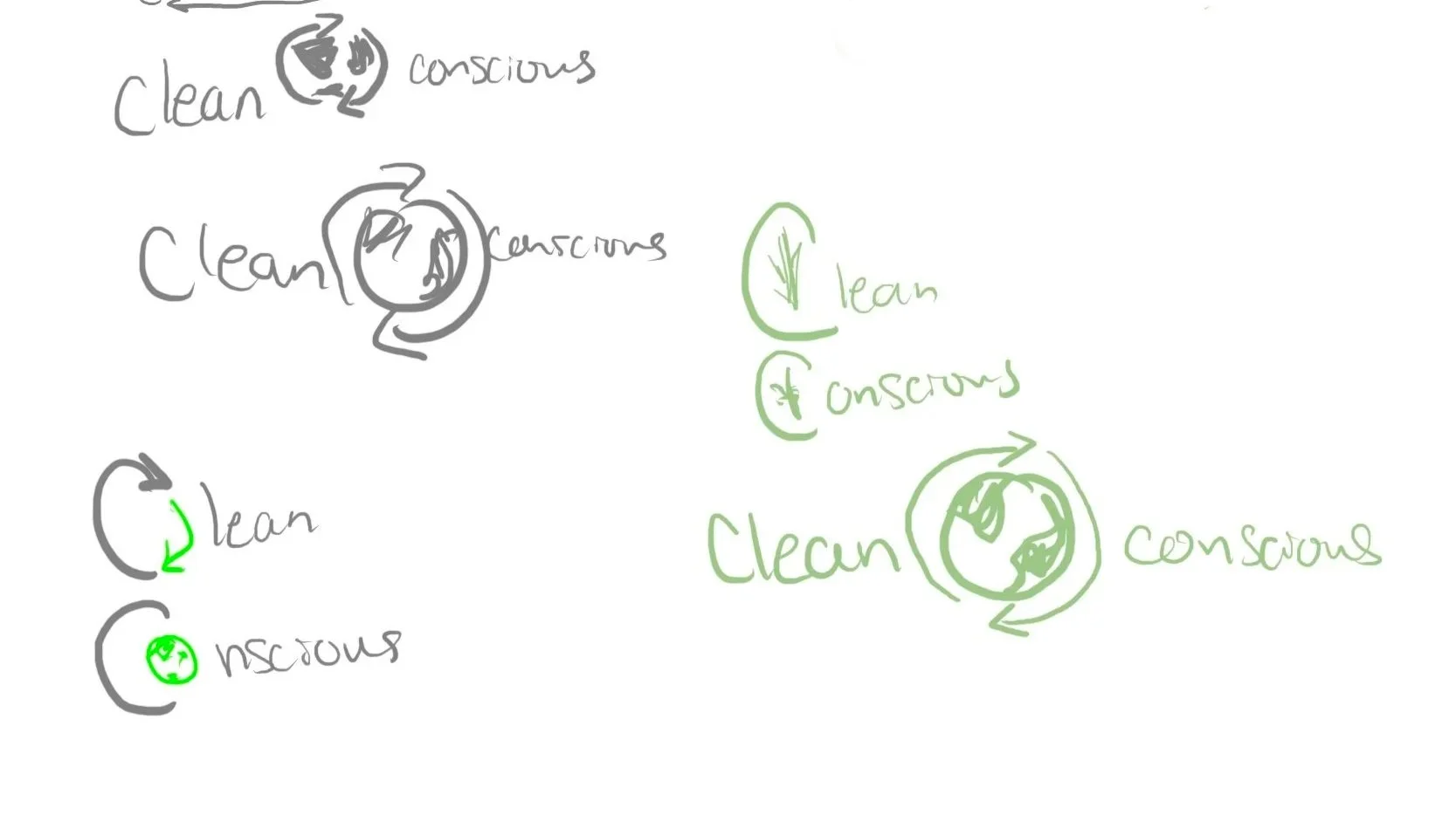
I began the project by exploring early ideas around mindful consumption, starting with research into the ‘Buyerarchy of Needs.’ My first direction was a concept called Clean Conscious, where I experimented with a logo and a poster that focused on reducing waste through small daily habits.
I ultimately shifted to Sustainably Savvy as it felt more aligned with the target audience of young consumers.

Iterations.
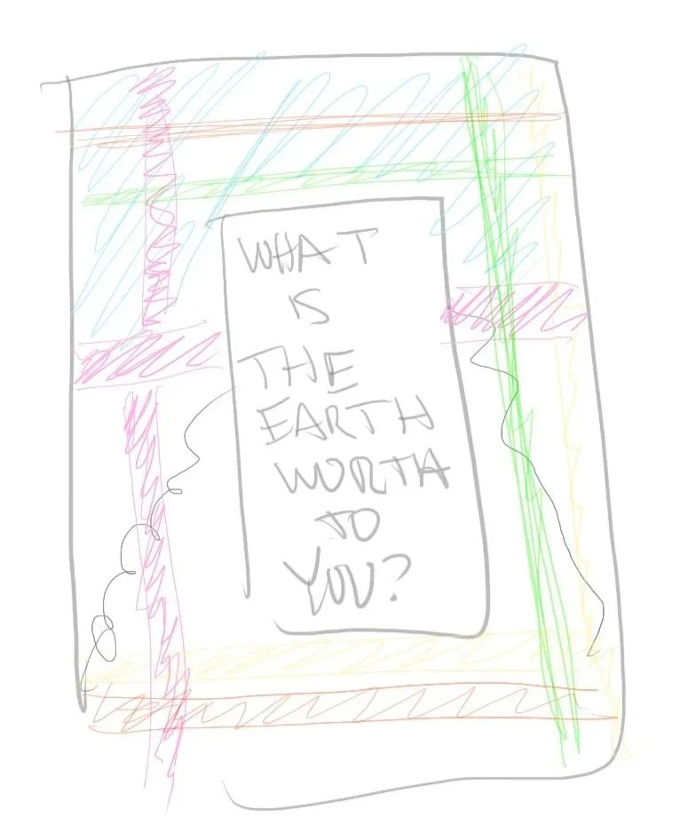
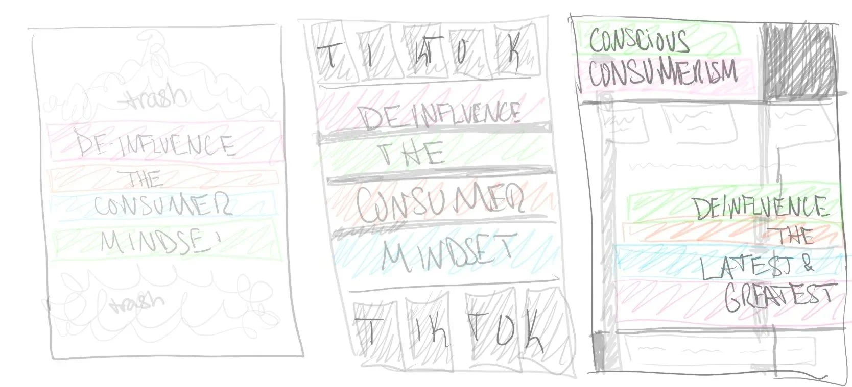
In this stage, I started tightening the visual direction and experimenting with how the messaging could feel more immediate and impactful. I pushed heavier typography and bolder imagery, but also played with whitespace to let the content breathe—a balance that helped clarify what tone felt right for the campaign.
These concepts showed me what was working and what still felt off, ultimately guiding me toward a more focused, cohesive direction.


Final
Posters.
These posters are designed to spark reflection. Through bold typography, and images of textile waste, each piece draws the viewer in, creating a moment to pause and consider: Is it worth the cost? I wanted to encourage viewers to contemplate their relationship with waste.
These posters are designed to spark reflection. Through bold typography, and images of textile waste, each piece draws the viewer in, creating a moment to pause and consider: Is it worth the cost? I wanted to encourage viewers to contemplate their relationship with waste.
Final Zine.
This zine brings the campaign into a tangible format, turning the core messaging into a clear, approachable guide for everyday sustainable choices. I designed it to feel bold but readable, using strong typography, purposeful whitespace, and layered textures to balance urgency with accessibility.
The zine walks readers through practical steps like understanding consumption habits and making more mindful purchases, while keeping the visual energy high and the information easy to follow. It serves as the final expression of the campaign’s goal: encouraging small, realistic changes that collectively make a meaningful impact.
